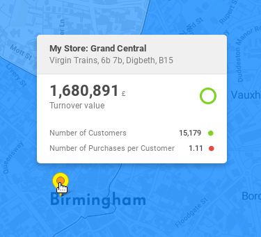
Markers
Marker represents a specific location on a map. It can be the location of a shop, a warehouse, an ATM, or anything else that has geographical coordinates.
Markers can be grouped and connected to a dataset in marker selectors.
Syntax
This is one of the two markers that can be found in the Retail Solution Demo. This marker represents the company's own shops. The other type represents partner shops.
The style of the marker is orange, and the filtering is done according to the partner property, which is either yes or no. The reference to the dataset containing the partner property (shops dataset) is defined in the respective marker selector.
Marker object syntax
{
    "name": "shops_marker",
    "type": "marker",
    "title": "Stores",
    "content": {
        "style": "marker-orange",
        "propertyFilters": [
            {
                "propertyName": "partner",
                "value": "no",
                "operator": "eq"
            }
        ]
    }
}
Example of a dumped marker
{
    "url": "/rest/projects/yufqzxkbiecj7jot/md/markers/v116eiot3uu3sjgf",
    "dumpTime": "2018-01-31T18:31:02Z",
    "version": "4",
    "content": {
        "id": "v116eiot3uu3sjgf",
        "name": "shops_marker",
        "type": "marker",
        "title": "Stores",
        "content": {
            "style": "marker-orange",
            "propertyFilters": [
                {
                    "propertyName": "partner",
                    "value": "no",
                    "operator": "eq"
                }
            ]
        },
        "accessInfo": {
            "createdAt": "2017-10-05T08:27:12Z",
            "modifiedAt": "2018-01-31T17:31:04Z"
        },
        "links": [
            {
                "rel": "self",
                "href": "/rest/projects/yufqzxkbiecj7jot/md/markers/v116eiot3uu3sjgf"
            }
        ]
    }
}
Key description
content
Key | Type | Optionality | Description | Constraints |
|---|---|---|---|---|
| boolean | REQUIRED | defines the style of the marker there are two shapes: round and squared there are four style groups: regular, check, cross and star see the available palettes below | |
| object | OPTIONAL | an array of dataset property filters, by which the marker will be filtered |
content.propertyFilters
propertyFilters object allows you to distinguish the markers by the properties specified in their dataset, to which they are connected to in a marker selector.
Key | Type | Optionality | Description | Constraints |
|---|---|---|---|---|
| string | REQUIRED | dataset property, by which the marker will be filtered |
|
| string long decimal boolean | REQUIRED | value, by which the marker will be filtered this key is polymorphic - it doesn't have only one type it can also be a single value, or an array:
| |
| string | OPTIONAL | defines an operator, which will be applied to the |
|
Visual representation
Markers are avaialable in various colours, sizes and shapes.
Quantitative markers
1-100 £ | 101-500 £ | 501-1000 £ | 1001-5000 £ | 5001+ £ |
 |  |  |  |  |
It is possible visualise the value of an indicator using quantitative markers of different sizes. There are two ways how to achieve this:
by setting the view.content.markersOnly property to
truenote that this will exclude all other granuluaritites from the view
by setting up a view with no granularity, other than the
geometryPointdataset containing the markers (which has to be specified in markerSelector.content.categories.dataset)e.g., no administrative units, no grid, etc.
Markers with shapes
marker-red | marker-blue | marker-green | marker-lime | marker-yellow | marker-orange | marker-pink | marker-purple | marker-turquoise | marker-brown | marker-gray |
 |  |  |  |  |  |  |  |  |  |  |
squared-red | squared-blue | squared-green | squared-lime | squared-yellow | squared-orange | squared-pink | squared-purple | squared-turquoise | squared-brown | squared-gray |
 |  |  |  |  |  |  |  |  |  |  |
This is the check marker palette:
marker-check-red | marker-check-blue | marker-check-green | marker-check-lime | marker-check-yellow | marker-check-orange | marker-check-pink | marker-check-purple | marker-check-turquoise | marker-check-brown | marker-check-gray |
 |  |  |  |  |  |  |  |  |  |  |
squared-check-red | squared-check-blue | squared-check-green | squared-check-lime | squared-check-yellow | squared-check-orange | squared-check-pink | squared-check-purple | squared-check-turquoise | squared-check-brown | squared-check-gray |
 |  |  |  |  |  |  |  |  |  |  |
This is the cross marker palette:
marker-cross-red | marker-cross-blue | marker-cross-green | marker-cross-lime | marker-cross-yellow | marker-cross-orange | marker-cross-pink | marker-cross-purple | marker-cross-turquoise | marker-cross-brown | marker-cross-gray |
 |  |  |  |  |  |  |  |  |  |  |
squared-cross-red | squared-cross-blue | squared-cross-green | squared-cross-lime | squared-cross-yellow | squared-cross-orange | squared-cross-pink | squared-cross-purple | squared-cross-turquoise | squared-cross-brown | squared-cross-gray |
 |  |  |  |  |  |  |  |  |  |  |
This is the star marker palette:
marker-star-red | marker-star-blue | marker-star-green | marker-star-lime | marker-star-yellow | marker-star-orange | marker-star-pink | marker-star-purple | marker-star-turquoise | marker-star-brown | marker-star-gray |
 |  |  |  |  |  |  |  |  |  |  |
squared-star-red | squared-star-blue | squared-star-green | squared-star-lime | squared-star-yellow | squared-star-orange | squared-star-pink | squared-star-purple | squared-star-turquoise | squared-star-brown | squared-star-gray |
 |  |  |  |  |  |  |  |  |  |  |
Markers with letters
It's possible to create a marker which has a letter in it, instead of a predefined shape. It's possible to combine any of the colours above, marker and squared shapes and any letter from the english alphabet.
For example: marker-a-blue, marker-r-lime, squared-c-yellow, squared-b-brown.
This is the full pallette for marker-x-blue, where x is the lowercase letter:
marker-a-blue | marker-b-blue | marker-c-blue | marker-d-blue | marker-e-blue | marker-f-blue | marker-g-blue | marker-h-blue | marker-i-blue | marker-j-blue | marker-k-blue | marker-l-red | marker-m-blue |
 |  |  |  |  |  |  |  |  |  |  |  |  |
marker-n-blue | marker-o-blue | marker-p-blue | marker-q-blue | marker-r-blue | marker-s-blue | marker-t-blue | marker-u-blue | marker-v-blue | marker-w-blue | marker-x-blue | marker-y-blue | marker-z-blue |
 |  |  |  |  |  |  |  |  |  |  |  |  |
After hovering a marker, a tooltip is shown. You can define its content in the dataset object.

If there is too much markers to display, the markers are clustered.


