In this tutorial, we have successfully loaded our business data into a CleverMaps project. What we have visualised is the absolute basic of what can be visualised.
We will extend the project in various ways in a series of additional tutorials.
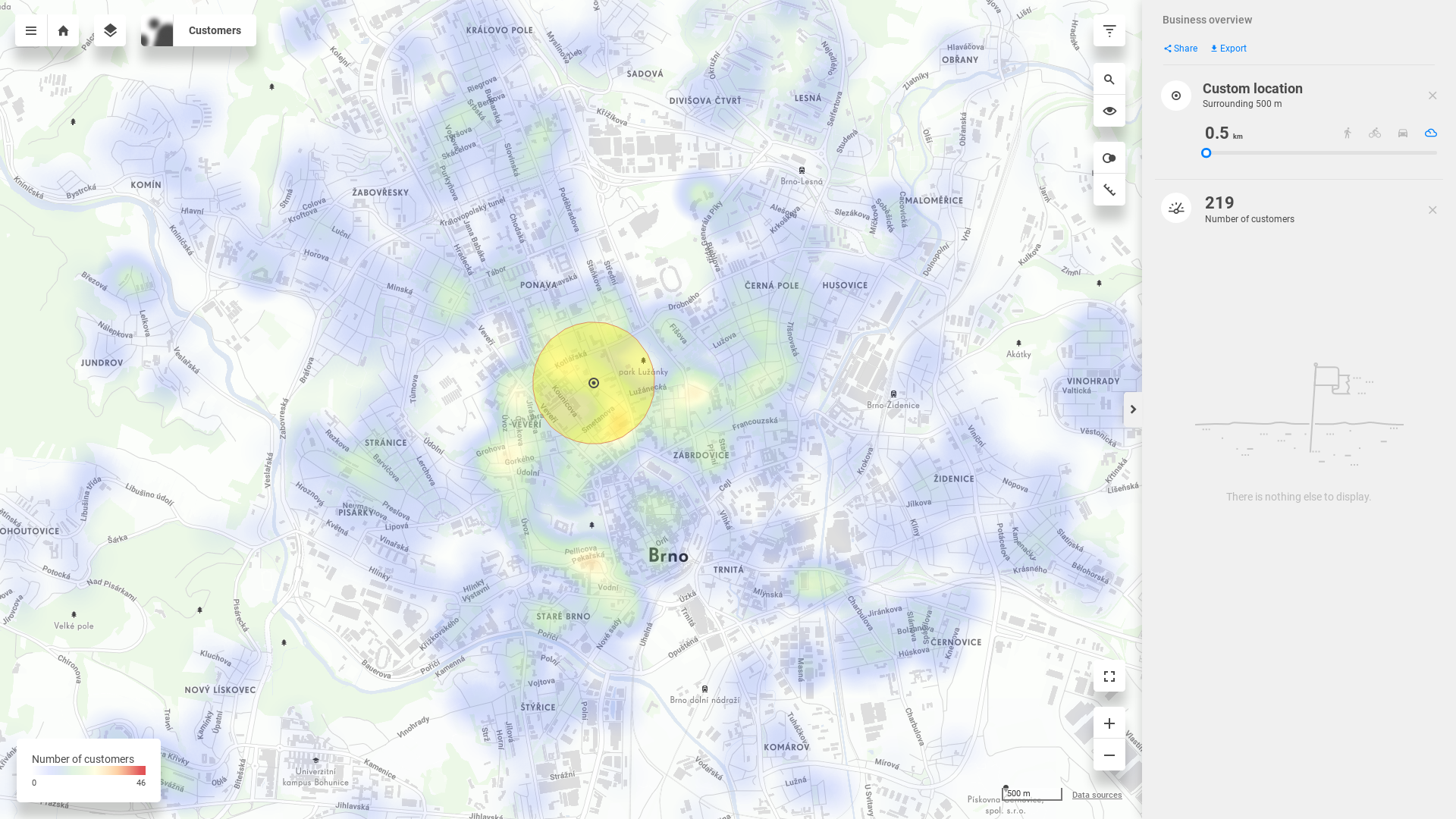
But now, let's have a look at what we've created. Click on the "Business overview" view card on the project page. What you'll see, is a base map of Brno and a dashboard containing one indicator.
Opening a view
Thanks to the view settings we've applied in the previous chapter, the map window is centered at correct location and zoomed at an optimal zoom level.
This is the visualization of our customers' addresses.
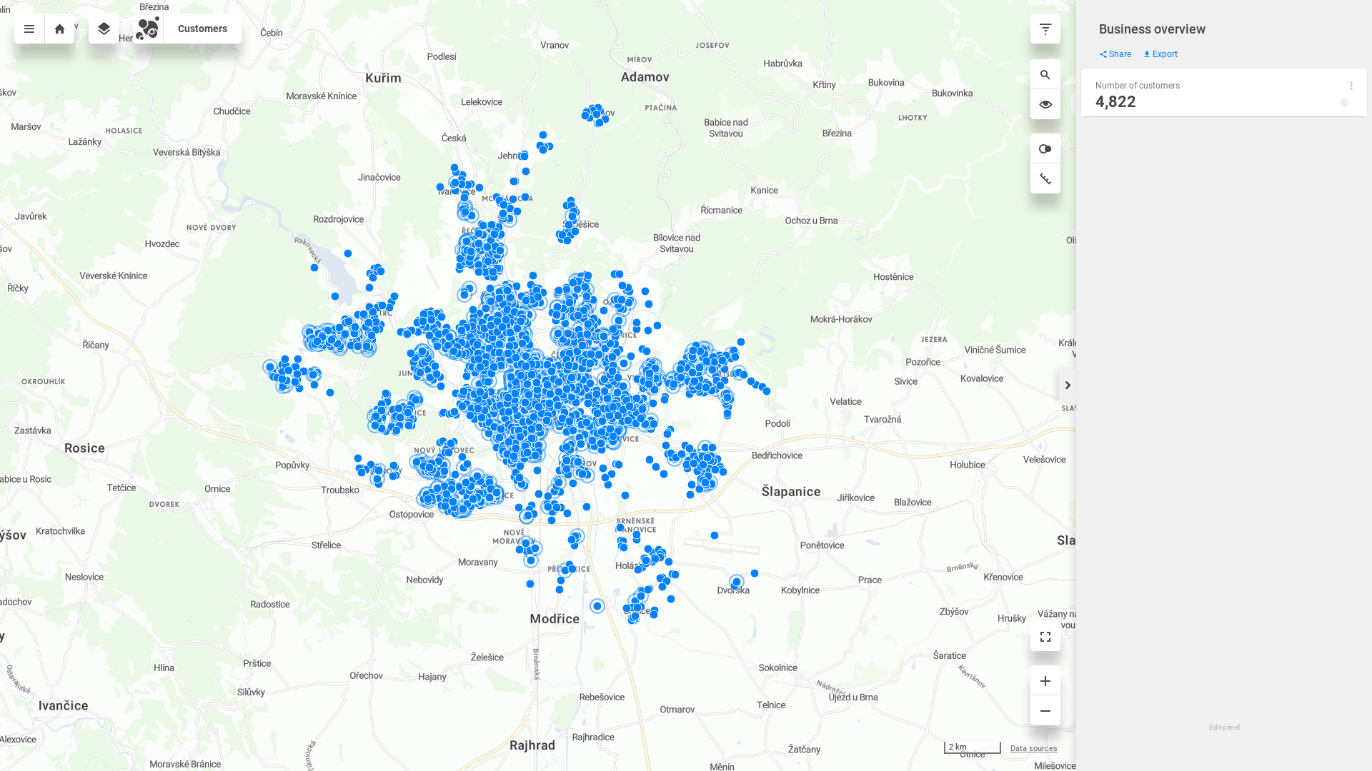
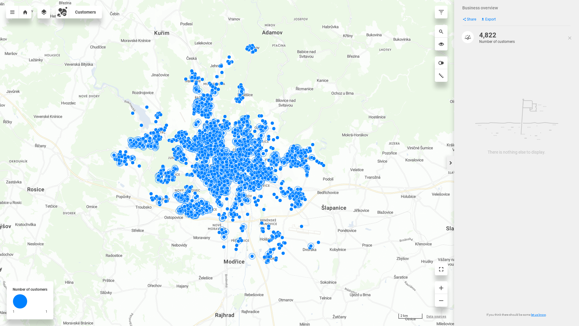
Click on the Number of customers indicator, and a legend window in the lower left corner of the map window appears. You may notice that nothing has changed, and all the dots are still the same size. This is because our indicator is a simple count of customers. And count of customers on one customer is always 1. We will take a look at this in the following tutorial.
Switching the visualization
Switch the visualization from dotmap to heatmap in the drop down menu in the top left corner.
And the points in dotmap will form a heatmap visualization. Since the result of Number of customers is 1 on all, this visualization will be more interesting when we introduce more indicators.
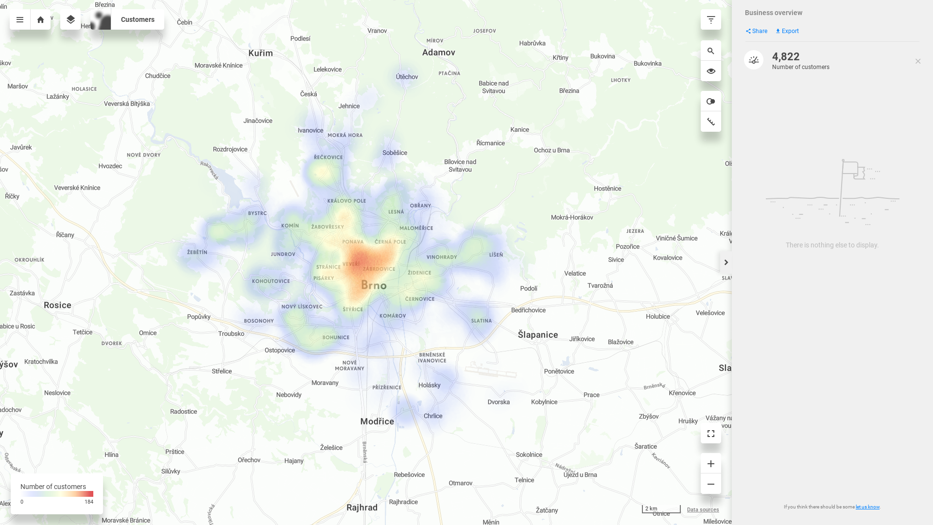
You can click anywhere in the heatmap to examine custom location. The spatial query will return the result of drilled indicator in given area - 500 meters by default. The size can be changed, and you can select driving/walking distance instead of radius.
This is the end of the tutorial for creating a project and basic data visualisation in CleverMaps.
You have successfully completed the first tutorial! In the following tutorial, you'll learn about data model and data dimensions.